 Cover fashions change. One of the things that brought this home to me was last year’s Goodreads awards, where all but a couple of the nominated “Best Romance” books had drawn covers— the graphic novel illustration style.
When I first started reading M/M, the “two guys photoshopped together” cover was the heavyweight. It had a certain utility. At that time, M/M romance was very much the tiny genre in a sea of M/F. The “two guys” covers made sure people knew what they were getting (from both an appeal and a warning standpoint.) Less confusion meant fewer readers putting up those “OMG it’s gay” one star reviews. More visibility meant readers looking for M/M could grab it.
The big downside to those covers were that there were very few actual gay couple photos on stock sites, especially back then. So the ones that did exist got used to death, and the designers had to work hard to avoid stilted, mislit, or downright weird combos in photoshopping. There are some gorgeous covers of this type, and some not.
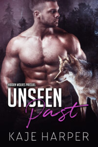
The next phase seemed to be the takeover of the six-pack abs. In pairs or increasingly solo. They’d been around before, but became preeminent— the heads half-hidden, the ripped effects of six million crunches and a day of dehydration on display. Romance is fantasy, and these guys are part of that fantasy. Gorgeous-bodied models on M/M and M/F books, (and sometimes the same guy on both, but readers were becoming more aware that M/M was an option you might come across. Or increasingly, look for 🙂 )
That moved on into the single-guy portrait covers for M/M and M/F alike, brooding or defiant or piercing, first looking to the side, but increasingly looking out of the cover straight on. The side-look variety are perhaps my favorite, because I find myself pulled into a story by an expression that promises emotions, although the single-guy covers definitely don’t make it easy to tell M/M from M/F with an unfamiliar author. And for authors, they demand that you find a stock-site cover guy who matches your story. If you write a tall, clean-shaven, red-headed dude with full lips and blue eyes… I wish you all the best.
Enter the drawn covers, at first for lightweight stories like rom coms. But now, as they become common and are no longer seen as a signal for “fluffy,” appearing on books as wonderfully emotional as Alexis Hall’s Glitterland and Sarina Bowen and Elle Kennedy’s Him and Us. My hat is off to the illustrators who are producing these covers, finding a way to put emotion into a simply-drawn character. There are some extremely talented artists out there. Some of these covers go back to the two men together, melding the advantage of the visibility with the ability of artists to create something natural and true to the story in each detail.
What comes next? I hope not AI covers, although I can see the appeal to book producers of cheap “custom” “art”. Perhaps the fact that these images cannot be copyrighted will reduce the onslaught. But it will be interesting to watch where the genre moves to.
 For my next book coming in April, I realized I cycled way back to the abs phase. Which is amusing in a sense, because I never had one of those covers at the time, and never planned to do one. But in this werewolf prequel story, Sawyer’s size and bulk are important to the plot, and this guy leaped off the stock site and said “me.” How could I resist having Jay Aheer put this man into one of those gorgeous covers Jay has created for the series?
The thing that still pulls me into a new story by an unfamiliar author the most is an intense-looking man with a serious expression. But it’s fun to see the range of covers, and in every style there are some that demand a second and third look. I don’t judge a story by its cover, but I do love that visual art is part of our books.
.
– Kaje Harper
March 2023