Photoshop! Can’t live with it, can’t erase that pimple from your selfie without it.
But wait, I hear you ask, you’re an author not an artist (and yep, I know some people are both but I am definitely not. Anyhow, you know what I mean). Why are you talking about photoshop?
 Thing is, words make a manuscript. They don’t make a book. To get from typing ‘The End’ on my work-in-progress to the book in a reader’s hands takes a whole lot of stuff that has nothing to do with words.
Some of which involves graphics.
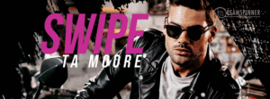
There’s the cover, of course. If you have a publisher that’s usually facilitated through them, but you still have to understand how a cover should look, what doesn’t read well, and what to dig your heels in on as opposed to what doesn’t matter so much. If you are self-pubbing then you hire a cover artist yourself (even if you are an artist, I’d recommend this in most cases unless you were also a commercial artist who was used to the business not the muse driving decisions). In that case you need to be able to explain what you want to them, so that you guys are on the same page from day one. Most contracts will only give you so many redos, so it’s risky to just let them do whatever they want. Sometimes it works out–KanaXa, who did Dead Man Stalking for me did me a cover that was EXACTLY what I wanted and one that was her idea and much, much better–but if it doesn’t then you’re kinda up the proverbial creek.
After that there’s graphics for marketing, for social media, your cover reveal posts, your website. If you do a blog tour then you might want to do graphics for that, either just to market it or as part of the tour itself.

The occasional .gif, however you want to pronounce it.
Or even just to put together a ‘mood board’ for yourself as part of your continuity bible. That doesn’t NEED to be pretty, but it is nice if it could be.
I learned how to photoshop in fandom. I wanted to make graphics and banners, and since I couldn’t draw… I am what I would describe as solidly amateur. I can put together something good enough if I have time and no boss but myself to satisfy. If I have cover art from someone else I can do a nice banner or something.
Basically, I’m quite good at collage but no one will hire me to do a portrait.
I think I need to be better. Mostly so that I can converse intelligently with cover artists and marketing departments so we weigh what I want against what they think works best in the current market. There’s things about cover design that you–or at least I–would never consider. Plus sometimes I just know that a cover isn’t working, but I don’t always know how to pinpoint what isn’t working.

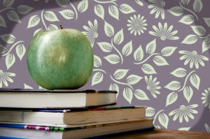
 So I’m doing some courses and trying to get better at the tools. I doubt I’m ever going to be doing my own covers, even if I discovered a knack for composition I’m slightly colour blind so that might be an issue. It has been before! Mostly it is so I can explain what I want to cover artists with more clarity–no one can be expected to deal with ‘It just feels…too digestivey?’–and partially so I can make nicer graphics for things. I can now convincingly, I think, turn a red apple into a Granny Smith!
It’s going well, so far. I think. I need to practice, of course, but I feel comfortable with the tools I’ve worked out and I understand what I can accomplish with them. It’s satisfying.

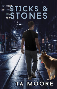
Hopefully it will pay off in improved graphics! And at least I can put together some passable covers for my freebies and shorts. I mean, it’s not bad! I made a bit of a mistake matching the light sources, and I forgot shadows but…I’ll get better.
Hopefully!