A warm welcome to author Heidi Cullinan joining us today to talk about her newest release “Antisocial”. Heidi talks to us about the cover art for her new release and there is a giveaway to participate in!
Welcome Heidi 🙂
Thanks for having me today! I’m here to talk about my newest release, Antisocial, a new adult gay and asexual romance set in a fictional college in upstate New York between a one-percenter fraternity boy and a highly antisocial artist. One encounter with Xander Fairchild’s artwork is enough to turn Skylar Stone’s carefully orchestrated life upside down, unlacing his secrets and inviting him into a secret anime-soaked world with a new set of friends. But will they be brave enough to embrace their fragile new relationship and let it last beyond the summer?
Today I wanted to tell you a little bit about the cover creation process of Antisocial, since it was different than my normal cover process. Well, parts of it were the same. It all started with me and a working collage which sat on my desktop and behind my Scrivener document, an image I made out of stock photos and out of my own mediocre skills.
The smoothing around the images is sloppy, and there are a zillion things not done well, and this is because I was the only one enjoying the image. I wouldn’t have minded someone making a cover something like this as a final, but I was certain other people could do better. This was more what the book felt like to me. And this is definitely what Xander and Skylar look like as far as I’m concerned.
When I got to the point this spring I had enough story and felt I could commission a cover, I also had a strong manga artist storyline, and between that and the Yuri on Ice creator dedication, I thought, I want to do something different. I reached out to the artist who did a lot of my favorite YOI fan art and asked her if she took commissions and would be interested in creating art for me, with the understanding my usual designer would still do the actual cover itself. She said yes, and so off we went.
Trick one, though, was that this designer is Japanese. She speaks very good English, but it turns out describing a novel takes complex English, and the more I tried to simplify things the more English I used. I’m embarrassed to say I handed her a twenty page synopsis.
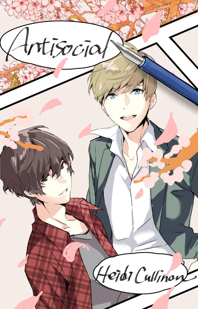
When it became clear we needed help, I hired an English native speaker who speaks fluent Japanese to translate a more sane length of a synopsis, and finally we were able to move forward, and Natsuko was able to present me with this, which she described as a draft.
I won’t lie; I opened the email message containing this image and screamed. I’ve had some seriously amazing covers, and Kanaxa is the best, but there’s something about someone taking characters from your head and drawing them for you and getting them exactly right. This is, essentially, a scene from the book, and it’s my favorite one. I had mentioned, yes, all these elements, but I’d also left the door open for her to create whatever she needed to. That it came out so perfect blew me away.
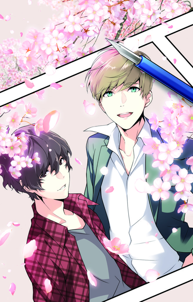
I had the draft version of this as the lock and home screen on my phone immediately, something I’ve never done before with a cover. I’ve never done that with a cover, period. As far as I was concerned, this was so good it was finished. So imagine how amazed I was to have the final version come in and look like this.
My daughter, who is also an artist, laughed because she too was impressed with the draft, and then she saw the final and realized how sketched-out the original cherry blossoms were. The final product was truly something else.
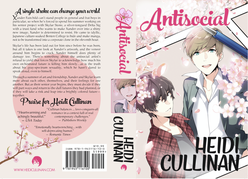
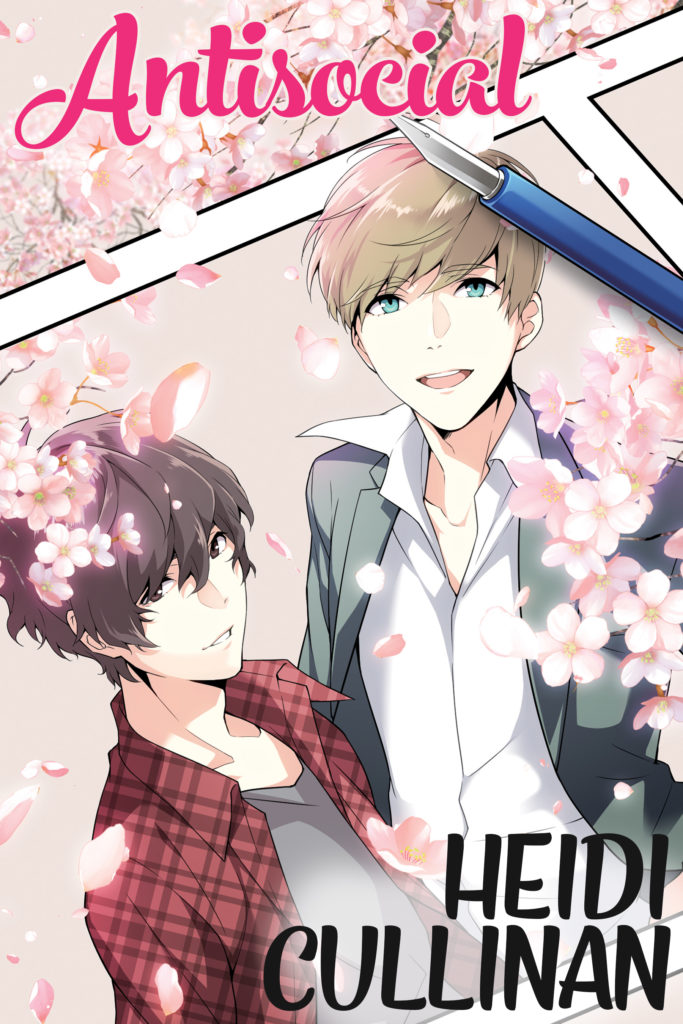
But the work wasn’t done. For the digital cover, things were fairly simple; Kanaxa and I had discussed a font, one I personally licensed, and we talked about how big to make it and where to put the name vs. the title, what colors, etc. Not so difficult, but important. The paperback cover, however, had work to do, and this is where Kanaxa shines.
I love what she did with the cherry blossom theme on the spine and the back, and the pink “sun,” but also the arrangement of the text and fonts and basically everything. She’s long ago come up with my logo as a brand symbol, tinting it the color that matches the book—this is all her, even though I’m the one who co-wrote the book on marketing.
It looks really amazing as a physical paperback as well—it’s a hefty beast, given the page count, but the thickness of the spine just makes it all the more delicious. Add to that BBebooks great internals and…well, it’s one of my favorite things, this paperback.
Now, as always at this point, I look back and my original collage and think, “this is why you only write the stories, Heidi.” Though I do like the images of those characters. That’s exactly what they look like in my head.
But boy do I like the way they look on the official cover too!
A single stroke can change your world.
Xander Fairchild can’t stand people in general and frat boys in particular, so when he’s forced to spend his summer working on his senior project with Skylar Stone, a silver-tongued Delta Sig with a trust fund who wants to make Xander over into a shiny new image, Xander is determined to resist. He came to idyllic, Japanese culture-soaked Benten College to hide and make manga, not to be transformed into a corporate clone in the eleventh hour.
Skylar’s life has been laid out for him since before he was born, but all it takes is one look at Xander’s artwork, and the veneer around him begins to crack. Xander himself does plenty of damage too. There’s something about the antisocial artist’s refusal to yield that forces Skylar to acknowledge how much his own orchestrated future is killing him slowly…as is the truth about his gray-spectrum sexuality, which he hasn’t dared to speak aloud, even to himself.
Through a summer of art and friendship, Xander and Skylar learn more about each other, themselves, and their feelings for one another. But as their senior year begins, they must decide if they will part ways and return to the dull futures they had planned, or if they will take a risk and leap into a brightly colored future—together.
Buy Links:
Amazon US ebook, Barnes & Noble, Kobo
Heidi Cullinan has always enjoyed a good love story, provided it has a happy ending. Proud to be from the first Midwestern state with full marriage equality, Heidi is a vocal advocate for LGBT rights. She writes positive-outcome romances for LGBT characters struggling against insurmountable odds because she believes there’s no such thing as too much happy ever after. When Heidi isn’t writing, she enjoys playing with new recipes, reading romance and manga, playing with her cats, and watching too much anime. Find out more about Heidi at heidicullinan.com.





This is without a doubt one of the best books I have read in years! At first I didn’t understand the cover, but now I realize how perfect it is to the story .A beautiful love story of a very different kind. The idea of making love by a touch of hands was so amazing! It moved me so deeply. Thank you Heidi Cullinan for writing this story. I will be reading it again and again.
The first time I’ve seen this cover, I was like, “WOW!” Yep! That good. And I’m so glad that there are changes made regarding the color of the cherry blossom. The final cover & the paperback had really set the mood of this story. Kanaxa totally rocks!