 Covers are a source of joy and angst for authors. I have these images in my head, but I’m not artist enough to transform them to the visual page myself. And then there’s the question of what readers want. What will draw attention? What will appeal? What will sell? What image represents the story I worked to put into words? And if an author or publisher decides to put a face on our cover, who is that guy?
Faces on M/M book covers draw all kinds of comments, good and bad. No picture looks like every reader’s mental image of a main character. And stock pictures have real limits. Like, real limits.
So do we try to find our man?
One option is to go faceless. That might be a lovely, non-figural cover. Or a man who is our MC, but turned away. Or one of the many variations of the headless guy(s), some of which are lovely, and which also have become a code for M/M romance. 


Or we can take the plunge and put a face to our man, or men.
My very first pro book – Life Lessons – was published when I had very little understanding of covers and stock sites. I think some readers don’t really know either how cover images come about. If you don’t go for an art cover (like the lovely King Perry by Anne Cain above) then most covers are done by photoshopping purchased images.
It is possible to buy an exclusive image. For a couple hundred dollars, give or take, you can own the rights to a picture that no one else will get to use (or, for more $$, the rights to a whole array of pictures of that model from a particular photoshoot.) That’s a great way to give your cover uniqueness and get the look you want.
I did that for Nick, from Tracefinder: Contact – I saw his face on Paul Henry Serres’ photographer site, and he was so perfectly Nick in my head that I bought the exclusive. 
But when quite a few M/M novels don’t earn more than $1000, and when paid editing may cost half to 2/3 of that amount, adding hundreds for a cover image is beyond many budgets. So we often go to stock photo sites. These are places to legitimately buy the rights to pictures that can be adapted, edited and used for covers. The pictures may cost anywhere from a few cents to $10 or so, depending on the deal you have. That’s a huge difference in outlay. But…
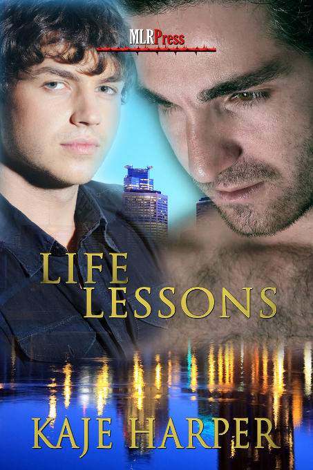
 For Life Lessons, I handed in a cover request. The cover artist (Lex Valentine) found me a couple of guys to look at. I fell in love with my Tony, and readers have liked him too, through the series. But Tony represents one of the issues with stock sites – good looking guys with pleasant expressions who are neither grinning like tooth-whitening ads, nor posing stiffly, are not thick on the ground. And they are in demand. So you end up with a guy who may appeal to others too. My Tony gets around.
.
.
On covers 


And, from where readers have spotted him, selling everything from toothpaste to condominiums. (I love the emails that say “I saw Tony cheating on Mac with a blonde in an ad for financial services…” but some readers get annoyed by the repeats.) He’s still my Tony, but I have no issue with all the others who find him appealing. Still, it can be a concern to have someone pick up a different book, see the cover, and have my Tony’s warmth, integrity, and sunny intelligence in mind before they meet the actual MC inside. Or of course, for my readers to be expecting Jared’s steadfast self-denial, or Rob’s cheerful Regency rent-boy, as they meet Tony. But with the limits on stock picks, it’s gonna happen.
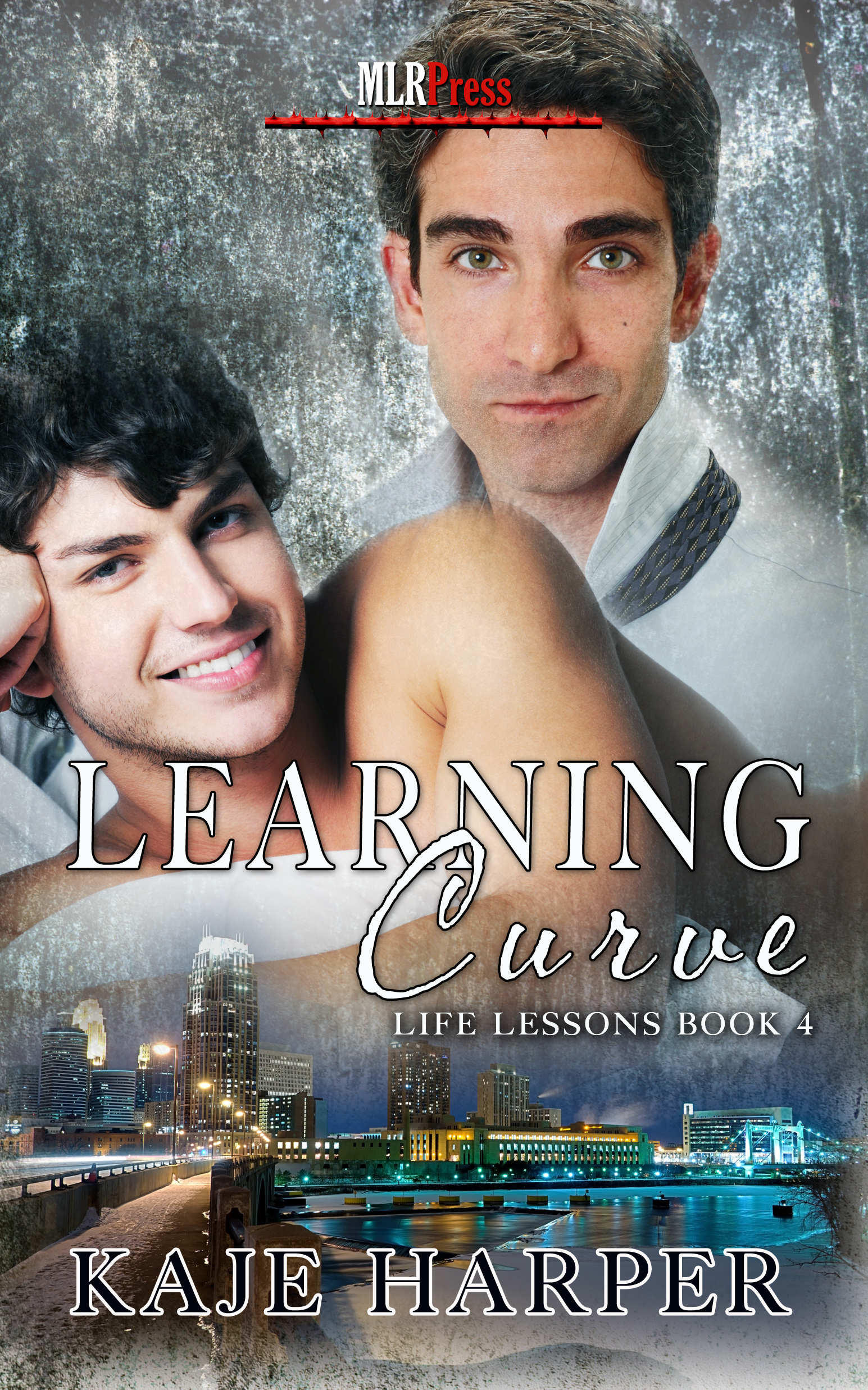
Mac represents the other issue with stock sites, that comes into play when you have a series. The artist’s first choice for Life Lessons was too waxed, too smiley, too gold-chain confident. I asked for someone less conventional, more brooding, more hair (and finding guys with chest hair is harder.) I got Mac, and loved the cover. But I hadn’t told the artist there was a sequel, let alone a series. And Mac is one of those stock site guys who is a ham, a clown, and a chameleon. But not one with a dozen great poses. Oh, Mac. Honestly? Yes, that’s the same Mac.


 I did manage to find one I liked for the re-release cover for the free short stories (with design and photo-manipulation from Karrie Jax.) Lessons learned, for a future series.
.
.
.
 So will I put guys on my covers going forward? Yeah, no doubt. It’s become my cover style, and there is a joy in finding just the right man for the story. Like my Brian, who I believe helps people envision the man I’m writing about – very blond, bigger, but soft not muscular, sweet, and solid, with his own kind of strength and a big heart.
Will I continue to wrestle with stock site options? No doubt. Am I exploring more exclusive options? For sure. (Check out Dan Skinner’s photography, for example, and other new sites with M/M pictures coming available.) Is there an answer to the perfect M/M cover? You tell me…
Very interesting post. I admit I am drawn to a book by it’s cover. I always hope the cover represents what the book is about. That doesn’t always happen, but at least I was drawn to the book because of the cover. If the book is part of a series I don’t mind the same face on the cover. If the book has nothing to do with another that I have read, I sometimes have a hard time relating to the character because I am think of the character in another book because of the picture on the cover. I am not an author just a avid reader, but I now have a little insight about how deciding on a cover can be a problem for the author.
It’s interesting that you do have that issue with the repeated pictures. I’ve wondered how much of a concern it is for readers, versus us authors angsting over every detail. Part of the difficulty is that no author or cover designer can know all of the thousands of covers already released (although one might do an image search I guess, if one was more computer-adept than I am.) And sometimes multiple people are working on a similar cover at the same time. I’ve had a new cover finished and paid for, and then seen something similar release before mine. One has to just laugh and keep on keeping on. Thanks for taking the time to read this.
Thanks for the interesting insights Kaje.
Whilst a cover may entice me to look at a blurb, it alone will not buy me a story. And whilst I may not agree that a cover model matches my image, they wont put me off a story – the words will sell me that tale!
Good to hear, since no cover guy works for every reader. The words are hopefully my strong point though <3
I like faces on my guys, I have to say, but to be honest, your blurb and brilliant writing keep me reading, not the covers. I loved the model for Tony, but Mac, I always imagined him differently so whilst I love to know the author’s idea of their main characters I have no difficulty substituting my image…quite often I have googled my view of your description (or my other favourites’ descriptions) then shop together. Sad but true. Anyway, your characters are rich, your stories wonderful, and I’m always ready for more.
That’s cool that you find your own visions of the guys, and that the covers don’t interfere. Thanks for the kind words about the stories. <3
Covers are such strange things! I’ve long had conflicting feelings about them. As a reader, I try and ignore them. The saying that you can’t judge a book by its cover isn’t around for no reason. Yet, in the days when there was no internet and we had to glance at tons of paperbacks in stands, the cover really was there for marketing purposes. “Hey! I’m a Romance, and a bodice-ripper with that kind of pose, and a historical with this kind of costume! Look at me! Pick me up and read the blurb on the back and buy me!”
I’ve long learned to ignore covers. The attractive covers might not contain the kind of story I want to read. The boring or ugly covers might be on some of my favorite reads. I really don’t see how a reader can really bother to look too closely at a cover and really associate it with anything but a kind of design to quickly identify a book quickly.
In these days of shopping online, I’m more easily able to sort of abstract covers in this way, since the cover images are so much smaller. I’ll be attracted, initially, to certain covers, as everyone is… Yes, it will make me take a look, as it is meant to do. But what matters is the author and maybe the title, but the blurb, still… and number of reviews and stars. Those latter things are what matter, not the cover. So it’s still a marketing thing, a bit (look here! this is the kind of book I am! check it out!), and a sort of visual/design/recognition thing (this is THAT book!). I’ve trained myself to disassociate the characters and image from the actual story and characters, though.
It’s rather interesting in my case because I’m an illustrator, long interested in cover art (although I haven’t done many covers, I’ve mostly worked in games). I do have an idea of what goes on with covers. I know everyone tries to match the characters on the covers with the story to some degree. But we know that a single image can’t really distill everything that’s in the story into it–it has to be what it is–an icon of sorts, something that stands for the story when people are scrolling quickly through things online. All the while pretending to be representations of the characters and a scene from the story.
Weirdly, even when I TRY to make the characters look like the characters on a cover–I mean, when I’m actually creating the cover myself!… I still don’t really see them that way when I’m reading. I guess I have a Right/Left Brained dichotomy that is naturally divided already in many respects. But I realize everyone is different.
So I appreciate a good cover, and do like having a good cover on books I read… but it never gets in the way of what I read. I don’t hold a bad cover against a book, I will check books out with good or bad covers to see if I want to read them, and I don’t associate the cover with the story in any specific way. This has all worked well for me for some 50 years of reading.
The story is what sells me on a book…not the cover… but it drives me crazy when the character descriptions don’t match the cover! I’m not sure what that says about me…other than the artist,illustrator or photographer should have read the book first before deciding on the cover, or the author didn’t give the artist/illustrator/photographer enough of a description to make the tie-in work.
Some of the best books I’ve ever read haven’t had any characters on them at all, or just a silhouette, such as N.R. Walker’s ‘Spencer Cohen’ series. That’s a safe way to go unless you have readers who need the visual.
Since I usually buy books by authors I love, I can honestly say in that case the cover doesn’t matter to me at all. But if an author is an unknown, a cover will catch my attention and I’ll read the blurb, and the reviews it’s received.
Thankyou, Kaje, I’ve been making a collection of book covers with the young couple on ‘The Family We Make’, & it doesn’t detract at all from my reading pleasure. A pet hate is two separate faces with noticeably different lighting collaged together; fortunately, not so noticeable on the Kobo’s black & white screen as on a hard copy! Generally, I prefer graphic, rather than photographed, covers, but I’ve read that people covers sell better, so I must be in the minority.