 A warm welcome to author Laura Lascarso joining us today to talk about her new release “Andre in Flight”.
Laura shares how she came to the cover she used and there is a giveaway to participate in!
Welcome Laura 🙂
When AngstyG sent me these cover comps it was really hard to choose just one–they’re all so beautiful and unique! I had to narrow them down by criteria, the most important being that the cover represent my story as much as possible. So, here’s my analysis of each one. You guys let me know what you think!
1. Biceps: I love the man in this photo—so strong and muscular—a stunning side profile. The font is pretty too, but for some reason, with the bird soaring in that way and the pensive expression on his face, it struck me as a Christian fiction novel, which my story is not.
2. Free Fall: I do love the simplicity of this cover and the unease of wondering what the figure is jumping into or from. Will he survive the landing? While I liked the sense of impending doom, I didn’t feel like it told much about the story itself, so I eliminated it.
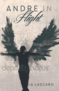
3. Grunge Angel: I really REALLY love this cover. I love the grunge element, the splattered wings, the pose of the figure, but it made me think of a novel about dance, which made me wish I had written a novel about dancers, but alas, I did not.
4. Sparkling Swan: Another truly breathtaking cover. I love the man’s squared figure, and the wings framing him are stunning, too. The font is cool and I even like the sparkles, but I worried this one might come off as a shifter novel or perhaps even a paranormal romance with angels and devils. Spoiler: there’s neither of those in ANDRE.
5. The Birds: This is the one that ultimately spoke to me the most. I like the lone figure, head down, who appears to be in contemplation, the multi-layering of the birds and clouds gives it an otherworldly feel, which I think represents my novel pretty well. It’s moody and atmospheric, similar to ANDRE, and I even like the subdued font in the title and author name, though AngstyG did darken it a little for me.
So, I guess these covers say more about what my novel is NOT about—no dance or shifters or angels, and very little religion. ANDRE IN FLIGHT does have two young men living in Miami, who fall in love, a painter and his muse and the strange turn their affair takes when one of the painter’s masterpieces is purchased by an eccentric art dealer.
So what do you think? Did I make the right choice? Which cover piques your interest the most?
Publisher: Dreamspinner Press, November 16, 2016
Blurb:
When up-and-coming Miami painter Martin Fonseca encounters youthful pretty boy Andre Bellamy washing dishes in the kitchen of La Candela, he swears he’s known him before, intimately. But Andre only arrived in Miami weeks ago, after running away from small-town Alabama and his abusive father. When Martin discovers Andre trading sexual favors for a place to stay, he offers him a room in his studio apartment. As roommates only. What starts as a playful friendship turns into something more as Andre begins posing for Martin, whose true passion is painting fantastical portraits. Martin’s obsession with Andre grows until they are sharing more than just flirtatious conversation. But when an eccentric art collector buys one of Martin’s paintings, Martin’s past jealousies resurface and threaten to destroy what he and Andre have so lovingly built.
Goodreads
Buy Links:
 Laura Lascarso lives in North Florida with her darling husband, two children, and a menagerie of animals. Her debut novel, Counting Backwards (Simon & Schuster 2012) won the Florida Book Award gold medal for young adult literature. She aims to inspire more questions than answers in her fiction and believes in the power of stories to heal and transform a society.
For social critiques, writer puns, and Parks and Rec gifs, follow her on Twitter @lauralascarso
Twitter: /lauralascarso
Facebook: /lascarso
Website: http://lauralascarso.com








I actually like the one you called “Biceps” as it piqued my interest the most. The one you chose “Birds”, when I first saw it, made me think the story was about an ancient Scottish tale of some sort. The man on the cover to me looks like he is wearing a kilt. But you are the author and you have the say as what it means to you. My lowly opinion really doesn’t matter. Good luck with the book!
Oh no, now all I see is a kilt, too! 😉 If you enter my giveaway, I’ll give you a chance to weigh in next time on the cover comps. (It’s actually really hard to make the decision as the author–it’s almost as if you know too much.)
not knowing enough about the book and what you actually wanted to show with your cover makes it a little difficult to be sure what draws you to each cover….I also am more drawn to “biceps” cover and funnily enough never even made a connection to religion from looking at it lol
I feel like the “birds” one has cut the legs off the model (with the placement of the clouds) and originally thought it was going to be about a double amputee O.o