 When I first started in publishing I can honestly say I had no clue about what made a good cover. If I could turn back time there are certainly covers I would change. I learned gradually what worked and what didn’t, especially in our genre. I can almost predict that the covers I like best, usually abstract, are not the ones that sell. I know artists are chomping at the bit to expand beyond the norm but our genre is romance. Photos sell better than illustration, two men better than abstract, etc.
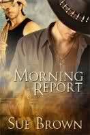
In the end I’ve made a lot of my covers as simple as possible, usually one man or two men in an embrace. I have one cover—yes, I’ll toot my own horn—that’s fairly well known in the genre, and that’s the Morning Report cover. It’s one of my early covers by the very talented Reese Dante. If you have a cover produced by Dreamspinner it was one of the examples, and is often cited as an example of a cover people love. Just as many loathe it, so I can’t get too big-headed about it.![SkyIsDead[The]](https://lovebytesreviews.com/wp-content/uploads/2016/03/SkyIsDeadThe-200x300.jpg)
The Sky is Dead is one of the few times I’ve deliberately picked an illustrated cover because I didn’t think the artists would be able to photoshop what I wanted. Now I work for the art department I know their artists have those mad skills, but I don’t regret this cover by Cris Griffin at all. She captured the very soul of my two boys.
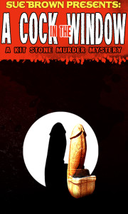
 I have many covers now. Some I love more than others, but maybe this one from Alex Corza puts a grin on my face more than any other cover. It’s exactly what it says on the tin, A Cock in the Window. Maybe it wasn’t my most successful book, but I do love the cover with a passion.
I’m grateful for each artist that tries to interpret my fumblings into art. You make my books real.