So I’m an odd mood. Mostly because it’s time to get back on the writing wagon following a break of doing art stuff. Now most of you know I do covers…and some of you loathe my covers…which is okay. (No it’s not. Hating someone’s stuff makes baby Jesus bunnehs cry.) I am a designer by trade and a writer by choice. Art and design pay the bills. Writing pays the insanity. It’s a crazy mix.
Covers are actually a pretty personal thing for authors. Many mainstream publishers don’t give the authors much say in what they get so it’s kind of lovely to work with Dreamspinner Press and self-representing authors to get what they want.
I wanted to share with you some of the covers I really enjoyed working on and explaining why. The biggest obstacle I —and many other cover artists— face is the lack of variation in stock photography. People wonder why some models are overused and the truth of the matter is two-fold.
One, I don’t definitively know what’s out there. No way to capture that knowledge and if I chose a cover model, it is six months or so before the book comes out. I have no way of knowing if he’s been used or will be used for months on either side of the book being published. And if two artists choose the same model for two separate well selling books, it’s a damning experience.
The second reason answers the most logical question of why do we see the same guys over and over. We don’t have an infinite amount of choices. Less than optimal. And God, the cheesy is there. And the arm raise over the head or the lifting of a shirt to show his abs. There are countless photos that look bad or are on a dark background which is very difficult to work with if the model is in shadow. But if you based your writing on preexisting photos, the reader will never seen an Asian or a redhead. Blonds are also in short supply. Headshots are usually our best bet but oh, how many headshots can you make work on a cover? It’s all about lighting, blending and prayer.
So let’s talk about covers I liked.
This was a challenge. Because steampunk is quite difficult to portray. I wanted it to be a bit dark but with pops of colour. Ah, someone asked me why I do bright colours for text. Easily answered. Because they show up when the cover is in thumbnail. These aren’t print books anymore. They’re mostly purchased in ebook format and in a small form, it’s got to catch the eye. It has to speak to the reader. DSP’s background is black. Amazon’s is white. A cover has to contrast against those backgrounds and at the same time, draw the reader in. Bright spots of colour can do that. Contrasting colours do that.
 Shot Through The Heart and Let It Go.

I love working with Mercy. Heh. There’s a lot of back and forth about tone and style—two very important components in design. Here we have two very different design styles, Let It Go (LIG) for M/M and Shot Through the Heart (STtH) for het. While they are both Western in nature, they speak to different audiences.
LIG is a very gritty Western of tension and men where STtH is brighter and a bit more of a traditional romance. Both should communicate sexual tension but within their genres. Colour treatments do this nicely. I enjoyed both of these.
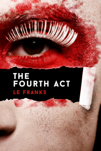
Now this one was kind of a side door project. LE Franks knew she wanted something but didn’t know where she was going to go. Then she had the foolish insane idea of trusting me. I went with something I knew she personally would like. Something catering to her aesthetics while at the same time, addressing the “stage and performance” feel of her book. Oftentimes, capturing the author’s personality is as much of a win as capturing the book’s contents. I really liked how this one came out. It was a simple but powerful punch of colour and a draw of the eye to the title.
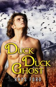
Okay, I can be totally honest and say I wasn’t happy with the first cover. It was… okay. I don’t like okay. But see, we go to the whole “blond” model scarceness in stock to work with. I end up having to settle for what I can get. This time, I said screw the rules and found a Tristan I really liked. I had to hunt deep for this one and I acquired him on a stock site I don’t even want to mention because it’s like a private horde. *grins* But this Tristan I liked. Muchly.
This communicates a bit of the supernatural feel and gives me a hot blond man for my cover. The gold and blue elements are blending well with the darker pieces and the birds above give a sense of heaviness. This was the second cover I did for DDG. The first one was… mostly okay but failed to pass the yay test. This one hit it.
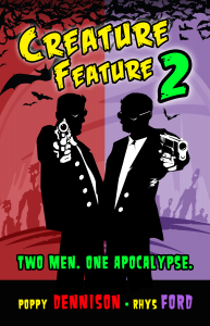 Last one is Creature Feature 2.
Now this was both fun and difficult. Because it’s a series, there has to be some connectivity but still distinct and separate because the team is different. The first book was a B-movie old school send up but this one is a bit different. Poppy had an idea on what she wanted and I was all in because the concept worked so well for this book. Much more Sin City but still with a B movie element. The colours were easy enough. Poppy Red and Rhys Purple. Somehow along the way, I ended up with Purple as a signature colour. Along with Black, which won’t translate to a cover.
The name fonts are a carry over from the first one and the colour scheme is bright and vivid to capture the action element of the book. Hell of a lot of fun.
So there you have it. Different covers. Different feels but definitely some of my faves. Regardless of the artist, the cover has to speak for the author first and foremost. And then communicates the author’s vision to the reader. I know some of you have some covers you love so… tell me what they are by commenting below.
I’ll do a random draw on the comments on August 7 and the chosen name will get a $15 USD gift certificate to the etailer of their choice—Amazon, Starbucks, Etsy, Paypal. Anything.
Okay, anything legal.

have to admit hot guys on a cover do it for me….can be just their faces, or torsos or whole body
I also like covers that show an animal (shifter) and human male together
‘Fighting Dirty’ by Olley White – I like the grungy look and the huge simple text that takes over the cover.
‘Undermountain’ by Eric Edstrom – This series has the same cover in different colors. The all have a dark cover with a glowing word in the center. Simple yet catches my eye.
“Payback” by JCP – I love all the covers of this series. The intense close ups, the same color tone and simple large text, makes it seem stark and emotional.
I tend to like covers with a single bright color against something darker or lighter, or monotone colors. Next covers that use a lot of texture, like your Clockwork Tangerine cover.
penumbrareads{at}gmail{dot}com
“Craven” by, Eden Cole. I love the torso shot, with interesting ink, surrounded by leather. It mirrors a painting mentioned in the book, as well as the image of the local rockstar main character. Hot cover, hot story!!
Wow thanks for an interesting post and for letting us readers know more about the selecting of cover process, as well as the issues you have with stock images being re-used.
I wish I could post all the covers I love and most of those have a mini story to book within and I like both photographic and illustrated. There have been some that have tempted me, intrigued me, some that make me think what the hell is going on here, the ah ones and hawt covers, then there is the covers that are maybe not so good but I am still tempted to check them out! Thankfully I have done that a few times, checked out a not so good cover, and found the book most excellent.
I love the mini story told from the cover of the ‘Clockwork Tangerine’ and its hints at its steampunk story within. I like it when symbolism is used within the cover. I could never pick a favourite cover, but just one of my favourites is Acrobat by Mary Calmes which uses the beautiful artwork of Steve Walker.
I like JL Merrow’s simpler covers – Pressure Head, Hard Tail, Relief Valve, Slam! – so The Fourth Act cover here appeals to me
I love the Clockwork Tangerine cover but The Fourth Act cover makes me want to read the book and I have no idea what it’s about. That cover captivates me.
Other covers I love are the King Perry and King Mai by Edmond Manning covers because they are beautiful but they also capture the essence of the books perfectly.
The Whyborne and Griffin series covers are gorgeous as well.
I love the Precog in Peril complete series cover because I cannot stop looking at it, it draws me in completely.
The Lavender Rose by Theo Fenraven cover is gorgeous as well.
I like covers that make me want to keep looking at them, that make me want to know more about the story, and that capture the heart of the story.
This was fun to think about.
It’s hard for me to put into words WHY I like something but there are quite a few covers that I like (and scads that I don’t like).
I think Josh Lanyon and Jordan Castillo Price have some really good covers. They aren’t the run of the mill headless torsos or floating heads.
I like the “feel” of the cover for “The Irregulars”. It isn’t pretty, but it has a kind of creepy feel, even though the profile kind of reminds me of Don Knotts. 🙂
Erinn O’Quinn’s Gaslight Mysteries have great covers.
Abigail Roux’s Gravedigger’s Brawl has a cover that captures the essence of the story.
I know what you mean about a lack of blondes to choose from. I’ve seen the same young blonde man on the cover of MULTIPLE books.
The blonde on the cover of Duck Duck Ghost is quite a find.
I like covers with models more than drawn people. It did depend upon how they were drawn too.
For myself, I want the cover to show something of what the story is about.
I like your covers, Rhys. 🙂 I also like Amber Kell’s covers too.
Yes, yes, yes! The cover often “sells” me. Not necessarily a confirmed buy, but at least a closer look. In today’s market, who can examine every title, even if I like the author’s work.
Just as important as the artwork, the placement, font, and color of both title and author are important.
If I can’t read a very small reproduction, I may not buy.
I find many of B.G. Thomas covers appealing in a vulnerable way.
Covers are often the first thing that draws me to a book, especially a book by a new to me author. I like a whole variety of different styles. The Clockwork Tangerine cover caught my eye immediately. I love the Whyborne & Griffin series covers. They seem to fit the books so well.
If I can add my two cents – Rhys has a true artist’s eye with a giant helping of taste to match. I basically dumped my Fourth Act request in her lap and begged her to “make me something”. That was it. She was familiar enough with the story that I didn’t bother giving her any cues. I can still feel the body blow of the impact I got opening up the file she sent me – it was so far out of the realm of what I thought possible it took my breath away. I was thrilled… still am really, every time I look at it. She has a real gift. Thank you Rhys!
Well…honesty I don’t put a lot of thought into the covers of books…there are books that I have loved that I think may have the worst covers I have ever seen…and some of the hottest or most beautiful covers were way better than the book. Double Full by Kindle Alexander is a favorite
Wow I learn something new every day. Great discussion. I am partial to Paul Richmond covers as he really is able to speak to how I *see* the characters. This new Tristan is spot on too! Much better than the first. I have always liked yours Rhys, I now know why tho. Micheal Breyette is awesome too, in the same way that Steve Walker was ( such a loss) , but like you mentioned their style is so distinctive that it speaks more to them than the author whose book they are gracing the cover of. I will have to watch more carefully if I am buying a book for the cover………auto buys not included. If its yours or Amy’s or Mary’s for eg. I buy sight unseen anyway.
Great post, Rhys! It’s always interesting to read about the thought processes that go into making cover art. I was a fan of the first Creature Feature, so it’s fun to see how you made it both similar and fresh. Even though there are plenty of covers that have drawn me into a book, my brain is freezing up on coming up with names. However, one clawed its way out of the vault, Damon Suede’s Bad Idea. It’s got simplicity in one way, but has all these great details that make it pop.
Thanks for sharing with us!
Archer’s Voice by Mia Sheridan is one of my favorites this year. The cover definitely is an important part of a book.
Dreamspinner cover artists do so rock. I have to say my favourite of my DSP covers remains Stained Glass. I showed the team the photograph that inspired the story and they went the extra mile, found the photographer and secured permission to use the image as the cover of the book. It made me so happy!
I really like how you designed Clockwork Tangerine. Ill buy the book it just for the cover and you can’t stop me unnie mwahahahahahahahaha
A cover definitely has to grab my attention in thumbnail view before it ever has a chance of me seeing a large version. I find that I’m more drawn to simplistic covers. If it’s too busy, it hurts my head, lol. I also tend to like the covers that stray away from the norm. The “typical” stock models don’t catch my eye at all. Give me something unusual and different.
I’ve had so many great covers. And I’ve had some horrible covers. Speaking of my own covers, while I absolutely LOVED the original cover for Wicked Game my het football romance, it had one lone male on the cover, after I became known for my MM books that cover was confusing. The new cover for WG is absolutely stunning. The colors pop. There’s a female. It’s feminine. It’s pink. Definitely sets it apart from my MM books. And after two years with the original publisher sales had stagnated. With the new cover, sales have picked up again. For a three year old book. It’s amazing.
But as far as my favorite covers that seem to be widely disliked. I love the Southern Scrimmage covers. Love them. When Rhys let me help pick the elements those covers became largely fun with stock photography. Every one of those guys are on other covers. Now. Not before. But it was how to get models who came close enough and then how to fit them together. Blonds are almost non-existent in stock photography. Well blond men. There are tons of women. But the colors are what make those books. Each cover has a color that works with the tone of the book. The first one is bleak, gray, blue…the season is deepest winter…but the tone of that book is very dark. Sidelined is yellow and bright almost too bright. Glaringly yellow. It’s hot, it’s summer. It’s almost painful but fun too…like a day at the beach then you go home with a sunburn. Offside chance is Mardi Gras colors. Purple, green, gold….it’s about jealousy, pain, envy….greed….the numbers mean something even if they did start off as a joke……and seriously I think that of all of my personal covers those are my favorite. And I’d like to thank Rhys for doing them for me….and putting up with me during the process.
I enjoyed your guest post. My career having been in the arts (portraiture) I love looking at book covers. I tend to like people with faces rather than just headless bodies…maybe because of the aforementioned job. So have always loved your covers even before I realized you did them. I like lots of Josh Lanyon’s and Mercy’s newer covers. I find K.A. Mitchell’s usually appealing and for the faceless ones, Lou Sylvre’s Sonny and Luki books. I think The Fourth Act cover is striking and makes me inclined to buy it though I don’t know what it’s about.
I have a TONNE of covers I love. Some just pulled at random include Out of The Blackness by Carter Quinn, Splonters by Thorny Sterling (and he painted it himself!), The. Mingles Destinies of Crocodiles and Men, Plan B, the Sookie Stackhouse books by Charlaine Harris, Homo Action Love Story by Ben Monopoli, anything by Jordan Castillo Price, Bolt-Hole by Amy Lane, Handle With Care by Josephine Myles and many, many more, lol. What they do all have in common is clear titling and font that suits the rest of the cover and they convey a particular mood that fits the story. And they all lean towards a more artistic style, whether it be painted art, photography or graphic.
I have quite a few covers I love. Most of them are actually personal artist request/commission works. Heh, I have such a love for Anne Cain’s art. I love the ones she did for the Change of Heart Series by Mary Calmes and the ones she did for Wolf’s Own series by Carole Cummings. I love those drawn ones so much, mostly because it hits me right in my anime/manga/yaoi love. It’s so like a fan art of yaoi that I just… ahh~~ it gets me. LOL… but Also because well… these are far more personal than using stock photos. not that I DON’T like Stock photo ones, there are a good few handfuls that I love but the drawn ones, especially for those two series, make me squee every time I see them! 😀
arella3173_loveless@yahoo(dot)com
I really like the Creature Feature cover.
If the book is a contemporary MM Romance with a focus on the meet and greet of the couple, there is nothing I enjoy more than seeing at least one shot the lead characters face on the cover. That way every so often I can glance at the cover as I read about what the lead is doing.
If a book contains light MM or is yaoi-ish, I like art covers and yes, I love PL Nunn covers.
I also love MM books where the action takes place in Japan, Korea etc to have art covers. But that is mostly because I love men in kimonos or samurai outfits and artwork just makes those things either more romantic looking or stimulating to my eye.
If its MM with a mystery in addition to the romance, well, covers like your “Fourth Act” covers really intrigue for me.
Likewise, fantasy, and paranormal subject matter- covers like your “Clockwork Tangerine” work for me.
And nothing beats a closeup of a man with a horse or simply a group of beautiful horses for a Western.
Now I will say something truly horrific. Since I’ve been e-reading… I definitely do my initial judging of a book by its cover.
And I won’t read the blurb, let alone the “Look Inside” or sample excerpt if I can’t get pass the cover.
To me the “care” taken with the cover is a direct reflection of the care given to the story inside.
I know some publishers give no choice to their writers, in terms of cover selection but if a writer doesn’t feel the cover reflects their story I hope they speak up.
Things have changed since hard core solid book days, I, for one, like to see a beautiful wall of covers that stimulate me when I click open my Fire. There is a much better chance that I will read the story if the cover is sharp.
Well I have to admit I haven’t thought about half the stuff you mentioned, but it all makes sense now 🙂 One of the most compelling covers I’ve seen is the cover for Into This River I Drown. Back in the days when I used to buy more physical books I was swayed more by covers I think. With digital, I’m not sure the covers pull me as much. Although I have to say the covers for J.B. Sanders Glen & Tyler series certainly did. But that’s probably because I’m from Chicago and I love hockey and I saw the first cover right after the most recent Stanley Cup win, so that might have been part of it 😀 I created a shelf called Cover Got Me for that 😛 I also really love the PL Nunn illustrations and covers for Belinda McBride’s Uncommon Whore series – so much so that I chased her around at GRL last year to make sure I got one of the printed copies she had with her!
I love all kinds of covers though and all kinds of art really. I’ve got so much in my house I don’t have enough walls to display it all. *sigh*
Well I really love all the Rhys Ford covers. Your book covers always pop and make me look twice. The covers for Bailey Bradford’s spotless series are one of my recent favs. I’m sure there are plenty more I can’t think of. Mercy Celeste’s southern scrimage series are also great. And Toni Griffin’s Holland brothers series both the original and second edition covers.
I love B.G. Thomas’s covers, especially the first two in his Seasons of Love series with the Alphonse Mucha vibe. Another huge favorite, or series of favorites, are the covers for Andrea Speed’s Infected series. They capture the gritty quality of the novels and both the beauty and pain of her cat virus characters. The cover for The Prince and the Program is special to me because it was mostly designed by the author, who told me how all the elements were chosen and brought together. I will buy paperbacks sometimes for the love of the covers!
You said the magic word!!!!