Today we welcome author J.K Hogan on our GRL Blog Tour !
J.K is talking about covers and she is offering a giveaway on the end of this post!
check it out !
A Word or Two on Covers – Guest Post, J.K. Hogan
Hey all! Thanks for having me here at Love Bytes! You may have heard of me from my new release, I
Survived Seattle from Wilde City Press. If not, hello and welcome! I’m J.K. Hogan. Today I wanted to talk
a little bit about one of my favorite topics to rave—or rant—about. Covers!
Before I gave up my ‘evil day job’ to raise my son, now sixteen months old, I was a graphic designer
in the field of online & print marketing materials. In all of my jobs, I’ve been sort of a jack of all trades
under the graphics umbrella. I still very much enjoy creating digital media and artwork, and I still do it
for fun and also freelance on the side. So, needless to say I have high standards when it comes to covers.
My friends will tell you, if I see a cover I don’t like, I could rant on it for hours (discreetly of course).
While there are certain design elements I hate, or love to hate, my main pet peeve when it comes to
covers is poor craftsmanship: bad image extraction, fake hair, and other Photoshop 101 moves. Even if
it’s not my cup of tea, I can respect a professionally executed cover.
Some may say covers, and the art thereof, are declining in importance alongside the diminishing market
of print books and traditional publishing, but I disagree. Here’s why: Whether I’m scrolling through a
category on Amazon or Goodreads, scanning Facebook newsfeeds, or checking out new releases from
my favorite publishers or authors, the first thing—and sometimes ONLY—thing that gets me to click
through to the blurb is that amazing cover.
The cover is still the ‘public face’ of the book, even if it’s an eBook that doesn’t have a physical cover.
And conversely to the above, if I’m looking through new books and I see one with a heinous cover, I’m
going to skip over it on principle alone. It’s just the reality of things; I’m a reader, a writer, a wife, a
mother of a toddler…my time is very limited, so I don’t have time to investigate books that don’t look
good. Without that eye-catching cover, I won’t get far enough to find out what your book is about.
When I see a wonderful cover, I can’t stop thinking about it until I own the book. And when I do, you
can be sure I’ll look on the copyright page to see who designed it. Everyone has their own taste when it
comes to the aesthetics of book covers, and there are some well-loved (or overused, depending on who
you ask) features that show up time and again: the ‘headless hunky male torso’ some hate with an all- fired passion, yet some love because of the sheer hotness of the models; the ‘girl with long flowing hair
in a long flowing gown,’ mostly from YA paranormal; the ‘two guys and a cityscape’ which is common in
m/m contemporary.
I’ve seen some innovative covers that laugh in the face of ‘the usual suspects’ and I hope to see more in
the future—new models, inventive compositions, a deviation from the expected. I had these thoughts
in mind when I designed the cover for I Survived Seattle. Love it or hate it, I used some elements of the
familiar formulas but I also tried to add in a little of my own style to it. I love getting feedback on my
designs, as it helps me become a better artist. Here are some of my favorite m/m covers:
What are some of your favorite covers? (from m/m or any genre) What’s one thing you’d be happy
never to see on a cover again?
J.K is graciously offering a giveaway on a copy of her release “I Survived Seattle”
If you want to enter leave a reply on this post answering her question
Good Luck !


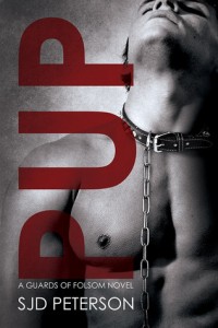

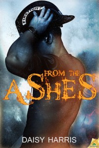

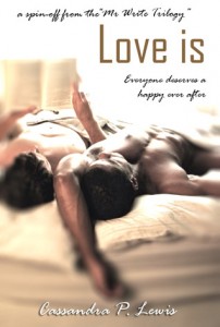



I know lots of people like them but I hate cartoon type covers they just look so out of place on a romance/erotic covers.
[email protected]
Photoshop is the Auto-Tune of the book world, I think. I hate “headless torso” covers of either sex, for sure. Great post!
Photoshop can be an amazing tool, but it’s only as good as the person using it. 😉 I’ve seen some examples where someone might as well have used scissors and paste. O_O
I am definitely NOT a fan of the headless torso cover, although it won’t stop me from buying/reading a book if the blurb/reviews are strong enough. I like all kinds of other covers, though, as long as they convey something specific about the story and catch my eye. I love the cover for Come Unto These Yellow Sands that you pictured above. I actually loved the cover of that book more than the story. 🙂 I did enjoy the story, but not as much as I thought I would from the cover. That was one book, where for me, the cover over promised: five star cover; four star story.
jen.f {at} mac {dot} com
LOL that’s good to know! I have one “torso” cover, but you get half of the guy’s face and I did that on purpose, because he has an identifying scar on his cheek. (this was for one of my m/f PNRs). Those who bought the print book got to see his whole face, because it bled onto the book spine. 🙂
A good cover sells the book for me. I’m not a fan of cartoon covers either nor do I like covers that use the same stock photo(s) used on other books. Love originality and really love it when an author can use their own artwork like MJ O’Shea’s revised covers of her Moon series.
[email protected]
I agree! There’s been a lot of overuse of a few cover models lately. I’ve found a photographer who I adore, and I’ve already used two of his photographs. I’d rather take a little bit longer to search for a new image than use a repeat. I love MJ’s new covers as well!
I love SE Jakes’ covers for the Hell and High Water series. I don’t mind headless torso covers if they are well done. I’m not a big fan and don’t like many of the cartoon – like covers. It doesn’t necessarily keep me from getting a book and enjoying it, but it does slow me down a bit.
I love half naked, tattooed men on covers…yummmmmm
not a big fan of cartoon covers
Ditto! I know they’re overused, especially in paranormal and m/f, but the classics are classics for a reason! 😉
One cover I saw about a year ago had a girl on it that almost looked cross eyed. I love the author but just couldn’t click it because of the picture in my head.
Totally understand. I’ve read books where I just didn’t like the cover model, and I always had to push that image out of my mind to try and get my own imagination fired up.
I love the covers on ‘Training Season’, ‘Knights & Butterscotch’, ‘Dex in Blue’, ‘Kiss'(LC Chase). I also love the one on ‘Plan B’ even if it was a shame and in no way looked like the characters in the book or the room in the story.
penumbrareads(at)gmail(dot)com
It bothers me too when the models look nothing like the characters (though I don’t remember noticing it with any particular cover altely). An author will probably never find a model that matches what’s in their head exactly, but it’s good to match general things like hair color and body type. 🙂
I acutally find covers where it is one person’s face with them staring straight at you pretty creepy. That’s not to say that I don’t like some of those covers, but I could do with just seeing from the nose down… A couple of my favorites really show emotion with very little going on, such as ‘Frog’ and ‘Talker’s Redemption’.
I really love the cover for ‘I Survived Seattle’ and can’t wait to read it!
aegger.echo @ yahoo .com
The close up face can be a little too much, although some of them work for me depending on the composition.
Thanks! I’m glad you like the cover and can’t wait to hear what you think of the book. 😉
Some covers that made me want to read the blurb are: Touching Evil by Rob Knight, Love Lessons by Heidi Cullinan, all the covers for the Hell or High Water Series, Blessed Curses by Madeleine Ribbon, and Snow Blind by Rose Christo. I don’t really like drawn covers unless the artist is really good and the rest of the cover layout is good. I hate covers with computer illustrated people that are very poorly done I will never bother with those books. I don’t like when a cover looks like it took about 5 minutes to make by someone with no artistic skill and doesn’t know anything about the book they are designing the cover for. Bad covers are one of my pet peeves and I could rant about them forever.
@AJ I agree. I love perusing the ‘bad covers’ tumblr websites just to have a chuckle with my friends, though I’m to nice to call out another author. I’ve learned from other authors that sometimes a publisher doesn’t give the author final approval rights. I was shocked about that, and definitely made sure in my contracts that that wasn’t the case for me.
Love Lessons was a great cover! That’s what got me to pick up that one too. Some of your other suggestions I haven’t heard of before, I’ll have to check them out. Thanks for stopping by!
Totally agree! There are some covers out there that makes me wanna bleach my eyes. Oh the horror! I tell my clients, if you can’t afford something better it doesn’t mean it has to look like Medusa and a cyclops had a love child, chewed up by a dog. Some times you can achieve alluring with a simple background and some font tweaking. Your cover needs to, not only represent your book but the heart of your story. Your cover has to hold emotion. My favorite cover is one I designed myself and it doesn’t have smoking hot men on front, its just grunge back ground tweaked to show the feel of the book. I like to be different, when you look at The Witch King Of California’s cover you wouldn’t say its a M/M romance or a romance novel for that fact.
But I do love I Survived Seattle’ s cover … a bit in love with it 🙂 ( OK, totally in love with it)
Fav covers? I could say “I Survived Seattle” 🙂 I tend to go for coves with hot guys – more recent ones (e.g., Riddle of the Sands, Cool Blue), classics (e.g., Hot Valley by James Lear, Song of the Loon by Richard Amory, Wicked Angels by Eric Jourdan), or sentimental ones b/c of movies (Brokeback Mtn, A Single Man).