
There is one horror that stands out above all, so atrocious that it makes me squeal. My skin crawls with shivers while my bone marrow freezes over, causing my hackles to rise.
It’s a horror story so old, and the honest truth is, some authors don’t even know they are afflicted. They are spreading like wildfire with a deadly infestation of crabs.
I call it, The Return of The Ugly Book Covers. *shudders* ( a graphic designer’s worst nightmare)
I see them poking out quite a number of times, during my adventures across Facebook land when I would be happily scrolling along and out of nowhere a bad book cover shows up.
My stomach coils in knots and I don’t know if I wanna stab out my eyeballs or chew off my wrist.
When I come across some of these covers, I always ponder what the hell went through that author’s mind when they first saw this. And hear me out, the scary thing is, it’s not just amongst self-published authors but publishers too.
I’m sorry, but I have no sympathy for a self-published author, who paid someone to do a book cover that turned out uglier than Freddy Krueger’s damn butt hole. How can you pay someone for something done so poorly? Publishers are different: the author doesn’t always have a lot of say as to who approves the cover unless they pay for it themselves. So I can still lend some sympathy to those authors but not to the publishing house.
But enough, before you come for my blood in an angry mob.
Let’s look at the anatomy of a book.
While the writing is the soul and the blurb the voice, your book cover is the face; the title its lips and the artwork its eyes because eyes are the window to the soul.
Do you see what I just did there?
Readers stroll through online bookseller platforms or browse in bookshops. Why do they look at a book when they don’t even know the author or the title or the blurb, yet they still make the effort to click on it, walk up to it and pick it up? It’s because the cover lured them to pick it up. It whispered with its appearance; “Hey, you? Come take a closer look at me, come stroke my spine or let your gaze travel over my face.”
Your book cover is the first marketing strategy to lure your reader closer. The title the second, the blurb the final pull to tell your reader; “You know you want to buy me and sniff my pages, sink your decadent eyes into my wonderful insides and taste me on your mind’s ear. Come on, honey. You know you want to, you know you want me bad.”
The marketing psychology behind book covers goes hand in hand with a blurb. A bad blurb almost spells out the entire story for you, leaving you to go read the detail, a good blurb gives you a small morsel but leaves you with questions while at the same time is so well crafted that you’re itching to want to know. Or better yet when the blurb gives you the answers but you have to find the questions.
Your book’s artwork needs to reflect your story. It needs to give the reader a glimpse, a feel. And by now it should already have set the tone of the story.
A dark romance will have a darker cover, a horror book will give you a sinister feel to your core, a mystery will look deceiving but also enticing at the same time. A book with a cold tone needs to enforce a shiver down your spine when you look at the cover.
Color gives rise to emotion. It can give the reader an indication of the feel of your book. We’re not talking about images here but just the color itself. Such a small thing that already plays such a big part to give your reader a glimpse into your story.
The saying ‘less is more’ is far stronger than most of us ever give heed to. If you are going to overcrowd your cover with too many images and words and colors, you’re gonna scare off your readers. Their attention would be drawn far quicker to something less complicated because time—and simplicity—can be far more striking.
Why time? Because we are always pressed for time. But did you know before you consciously decide to buy or do something, your brain has already decided if you will or not, and how you will go about it. The Max Planck Institute for Human Cognitive and Brain Sciences has determined our brain makes a decision on something seven seconds before we become aware of them.
Simplicity, on the other hand, can speak volumes. A single image is far more powerful than bunch of them all crammed into one space because your brain has one thing to focus on. Whereas if there are too many things going on, your eyes have skipped over the first thing and already moved on to the second before your brain can fully process the first.
The devil is in the detail and that devil is the thing that makes your reader come closer: the layout of the cover, the size of your font and the objects and the type of font you choose, all have effects on your reader.
Having a curling font is fine. Having an over curling font might be too much, making it hard for reader to even read the title. Distorted images, either stretched out, making them look like a rubber bands or compressed so much like they’re being squashed ( and to be honest here, this type of thing is an amateurish design mistake, you shouldn’t stand for it) also goes into play with lighting, shade and tone.
Readers will quickly pick up if your images—let’s say a male torsos or male figure’s tone and lighting—are different from that of the background. It’s going to stand out and not in a good way. You don’t want a cut and paste piece of artwork on your book.(Unless that is your intention)
Font color is another thing. Yes, your font needs to pop out from the artwork because it’s the title of your book; usually when your book has a darker blue color tone, you would pick a lighter blue for the font to accompany it. If that doesn’t work, you resort to a complementary color; either its opposite or its near opposite. It seems that some designers just ignore this fact—some just ignore the whole theory of color—but on the other hand in defense of some designers, the client has the final say in the cover, and even against our( graphic designer’s) better judgment, we go with what the client wants.
Another thing is the font itself. You need to look at the size and the font choice. Also, using too many different fonts can lead to a disaster. Another big mishap is when the author name and book title and tag lines are all over the place.
Your cover needs to invoke a fierce emotional reaction from your reader, whether it be lust, fear trepidation or a racing heart. You have already won them over in forty percent of their decision on whether they will by it or not. Ten percent for it depends on the title and the remaining fifty to blurb and price. However, everything I had just said is totally irrelevant if you have already fallen in love with the author’s writing, and couldn’t give a smug damn about the cover.
Some recent cover that I have seen that really made me pause and go ‘wow, I don’t care about the blurb or the title or author, I want to read that picture’s story!’

Immediately I get a soft feel of a tender story, but a sense of sadness, loneliness, pain but also a journey of healing perhaps—despite the cover depicting two men in an embrace. The leather couch could represent a maturity of something maybe a relationship, a person or letting go of the past.
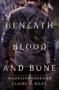
Beneath Blood and Bone by Madeline Sheehan, Claire C. Riley
Unconventional yet still eerily striking and in away beautifully masculine, one wouldn’t say this is a horror by any means. A sense of isolation comes to mind, the faded appearance give a sense of something lost, a diluted filter of hope that may never come. The imprint on the shirt; a beacon of a savior who might not entirely be an angel if we go on the tattooed skull on his arms.
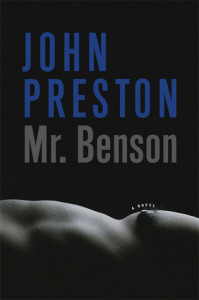
Dark, depraved, striking, yet still gives you a sense of sexual desire and erotica, a hunger within the mystery of something. The over dominating black, a portrait of preying on something or someone.

Striking with the immediate thought of hardassery, it’s obvious with the cop car there and the holster belt that this is a cop story, but there is a delicate masculinity to the cover that I can’t quite place and that already has me wanting to find out if it is portrayed within the book, but I can also see some alpha males rutting with their over large egos rubbing against each other.
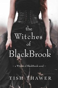
The Witches of BlackBrook by Tish Thawer
A sense of empowerment of a woman or maybe strong female lead, it also gave a sense of both old and new; the dress is partly Victorian, but modernly portraying the appearance from something of older times with the corset. Black does not always represent dark, it could be a paranormal or magic, mystery, the unknown.
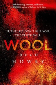
Wool Omnibus Edition by Hugh Howey
This one I have to say stumped me. Grotesquely beautiful and stylish, it leaves nothing to the imagination and thereby I mean there’s nothing you can draw from it, but at the same time you just can’t seem to look away. And therein lies the genius of it. One could say the red could be blood; a representation of violence or chaos. But the whole concept of this cover’s beauty, its genuineness is that it forces you to find out more, to read the title, which in itself is striking. One word titles always are and yet it still leaves you with nothing. Which forces you to look at the tag line which is so intriguing but still does not offer you much, but leaves you with the answer but not the questions. Hence, you go read the blurb. The book cover did its job.
Please feel free to mention your favorite and most gripping book cover in the comments and why, I’d love to hear about them.
I love Jay Aheer’s work. I think her covers are softly colored but very artistic.
I’m definitely a fan of her work!
There are some amazing cover artist, Jay is one of the best.